In this redesign exercise, I incorporated a more extensive icon system, updated the color scheme, and updated the look and feel of buttons for the Redbox interface. There was no access to formal user testing for this project—instead, I used UX principles to create an interface that caters to the diverse needs of the user.
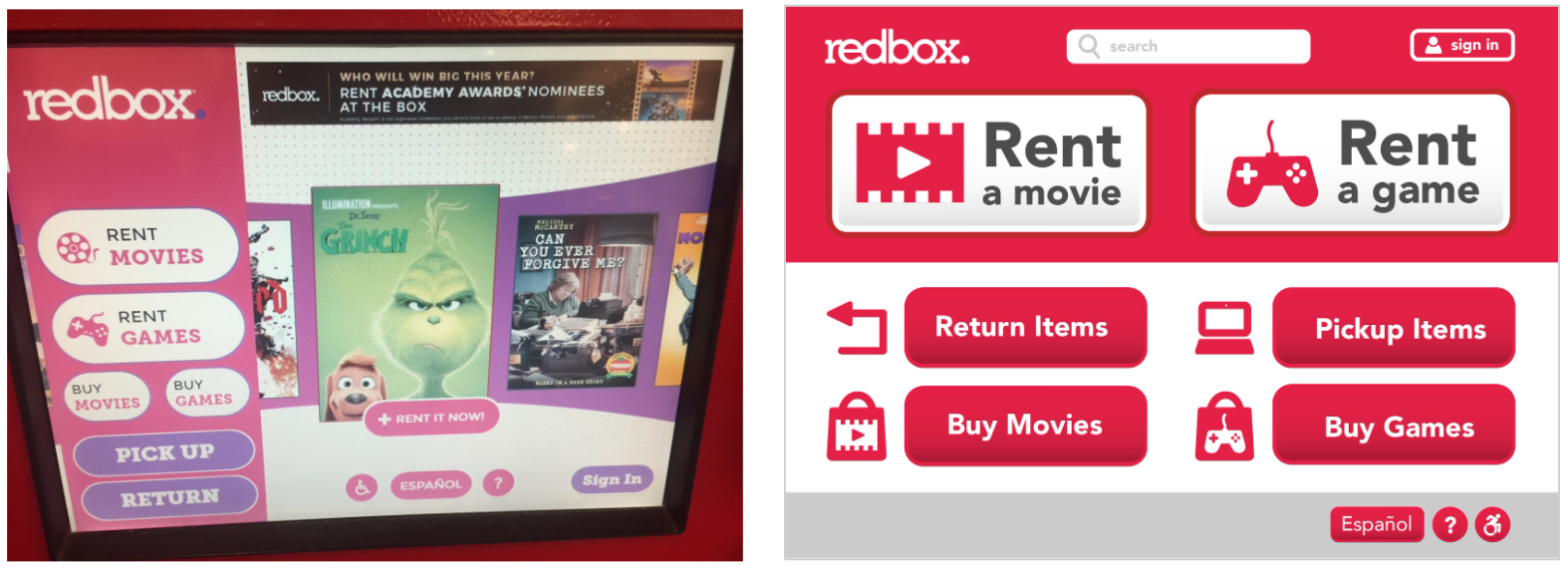
The redesigned page (right) attempts to reduce clutter from the initial screen. While the quick 'rent it now' button could be useful for some users, it is unlikely that most users would rent the first movie they saw. The redesign promotes browsing in the hopes that users will rent multiple items. Further testing would be needed to confirm these assumptions.
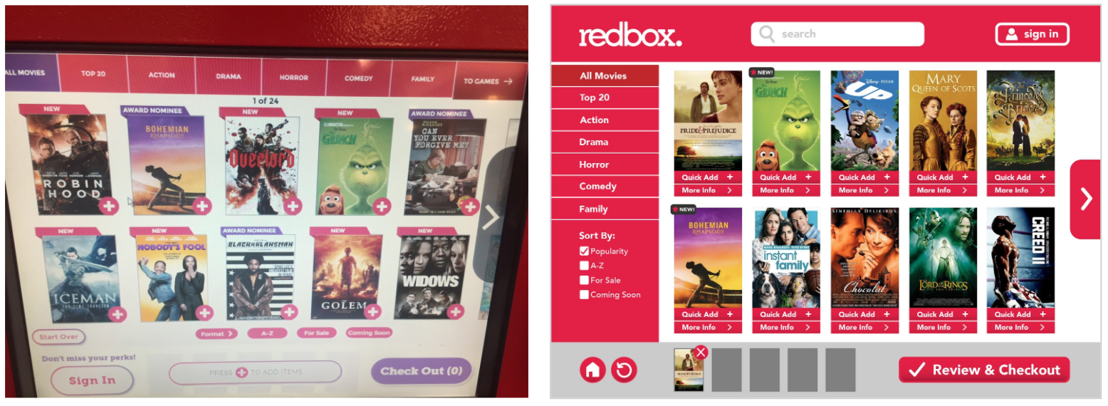
In the redesign, 'quick add' and 'more info' were added to minimize guesswork. A cart preview was also added to the bottom so that as they browse, users could see the items that had already been added to their cart.
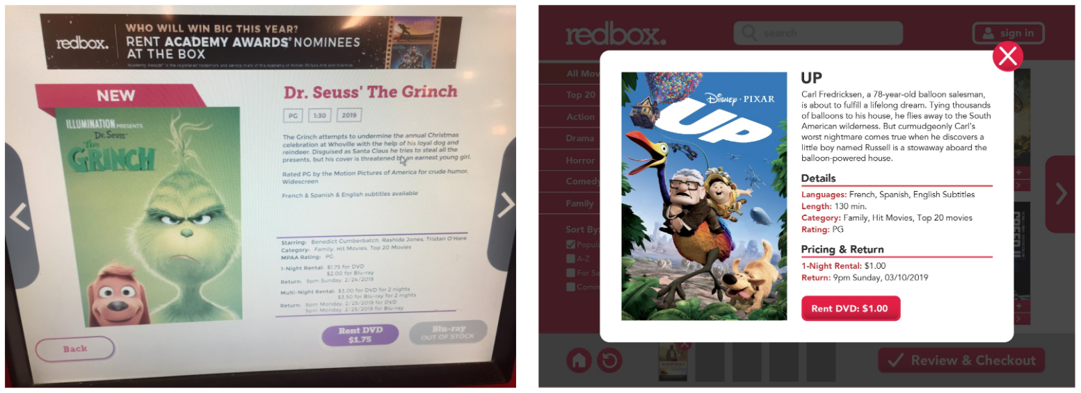
Instead of taking users to a new page after clicking 'more info', the redesigned page simply uses a popup that the user can easily click out of.
The redesign uses larger, bolder buttons. Some Redboxes are outdoors where vision can be affected by the sun and other factors, so more conspicuous type was needed.
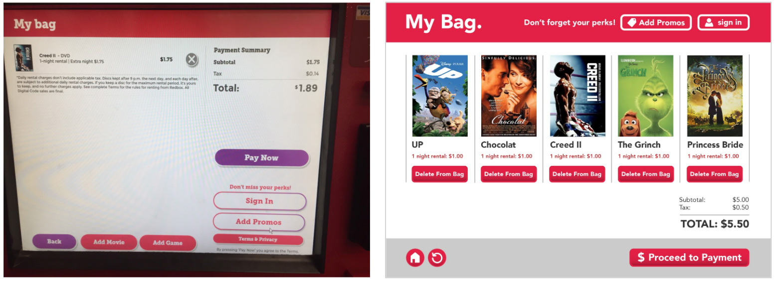
The 'my bag' page was visually imbalanced. The redesign has a more visually organized layout that guides the user’s eye.